

We may earn money from the companies mentioned in this post. Your purchase won't cost you any extra, but it helps support the content and upkeep of this website. Thank you!
In today’s digital age, mobile devices have become an integral part of our lives. With the increasing number of smartphone users, it is crucial for businesses to optimize their websites for mobile users. Mobile SEO, or search engine optimization, plays a vital role in ensuring that your website ranks well in mobile search results and provides a seamless user experience.
This article will explore the latest mobile SEO trends and strategies that can help you optimize your website for mobile users. From responsive design to mobile-friendly content, we will delve into the key elements that can enhance your website’s visibility and performance on mobile devices. So, let’s dive in and discover how you can stay ahead of the curve in the ever-evolving world of mobile SEO.
Table of Contents
Importance of Mobile SEO
Mobile SEO is becoming increasingly important in today’s digital landscape. With the rise of smartphones and mobile devices, more and more people are accessing the internet on their mobile devices rather than traditional desktop computers. As a result, optimizing your website for mobile users has become crucial for businesses and website owners.

Enhanced User Experience
One of the primary reasons why mobile SEO is important is to provide an enhanced user experience. Mobile users have different needs and expectations compared to desktop users. They often have limited screen space, slower internet connections, and are on the go. By optimizing your website for mobile users, you can ensure that they have a seamless and enjoyable browsing experience. This includes having a responsive design that adapts to different screen sizes, fast loading times, and easy navigation.
Higher Search Engine Rankings
Mobile SEO also plays a significant role in improving your website’s search engine rankings. Search engines like Google prioritize mobile-friendly websites in their search results. They understand the importance of delivering relevant and optimized content to mobile users. By implementing mobile SEO best practices, such as using mobile-friendly design, optimizing page speed, and ensuring mobile-friendly content, you increase your chances of ranking higher in mobile search results. This can lead to increased visibility, organic traffic, and ultimately, more conversions and revenue.
Mobile-First Indexing
Google’s mobile-first indexing further emphasizes the importance of mobile SEO. Mobile-first indexing means that Google primarily uses the mobile version of a website for indexing and ranking purposes. This shift in indexing prioritizes mobile-friendly websites and content. If your website is not optimized for mobile users, it may not perform well in search rankings, resulting in missed opportunities to reach your target audience.
Growing Mobile User Base
The number of mobile users continues to grow rapidly. According to Statista, the number of smartphone users worldwide is projected to reach 3.8 billion by This trend highlights the importance of catering to mobile users and ensuring your website is optimized for their needs. By neglecting mobile SEO, you risk losing a significant portion of potential visitors and customers.
Competitive Advantage
Investing in mobile SEO can give you a competitive advantage in your industry. Many businesses are still lagging behind in terms of mobile optimization, which means there is an opportunity for you to stand out from the crowd. By providing a seamless mobile experience, you can attract and retain more mobile users, differentiate yourself from competitors, and build a strong brand reputation.
In conclusion, mobile SEO is of utmost importance in today’s digital landscape. It not only enhances the user experience but also improves search engine rankings, aligns with mobile-first indexing, taps into the growing mobile user base, and provides a competitive advantage. By prioritizing mobile optimization, you can ensure that your website remains relevant, visible, and accessible to mobile users, ultimately driving more traffic and conversions.
Mobile-Friendly Website Design
In today’s digital landscape, having a mobile-friendly website design is crucial for businesses to succeed online. With the increasing use of smartphones and tablets, optimizing your website for mobile users is essential to provide a seamless browsing experience. This section will delve into the key aspects of mobile-friendly website design and how it can enhance your mobile SEO efforts.
Responsive Web Design
One of the fundamental elements of mobile-friendly website design is implementing a responsive web design. This approach ensures that your website adapts and adjusts its layout and content based on the screen size and resolution of the device being used. By utilizing responsive design techniques, your website will automatically resize and reformat its elements, such as text, images, and navigation menus, to fit perfectly on any mobile device.
Mobile-Optimized User Experience
Creating a mobile-optimized user experience is vital for engaging and retaining mobile visitors. Mobile users have different needs and behaviors compared to desktop users, so it’s crucial to tailor your website accordingly. Consider the following aspects when designing for mobile:
Simplified Navigation
Mobile screens are smaller, making it essential to simplify your website’s navigation. Implementing a clear and concise menu structure, using dropdown menus or hamburger menus, can enhance user experience and make it easier for visitors to navigate through your site.
Streamlined Content
Mobile users typically have limited attention spans and are often looking for quick information. Therefore, it’s important to streamline your content for mobile devices. Focus on concise and scannable text, use bullet points or subheadings to break up content, and optimize images for faster loading times.
Touch-Friendly Elements
Since mobile devices rely on touchscreens, it’s crucial to design touch-friendly elements. Ensure that buttons, links, and interactive elements are large enough to be easily tapped with a finger, avoiding any accidental clicks or frustration for users.
Fast Loading Speed
Mobile users expect websites to load quickly, even on slower network connections. Slow loading times can lead to high bounce rates and negatively impact your mobile SEO. To optimize your website’s loading speed for mobile devices
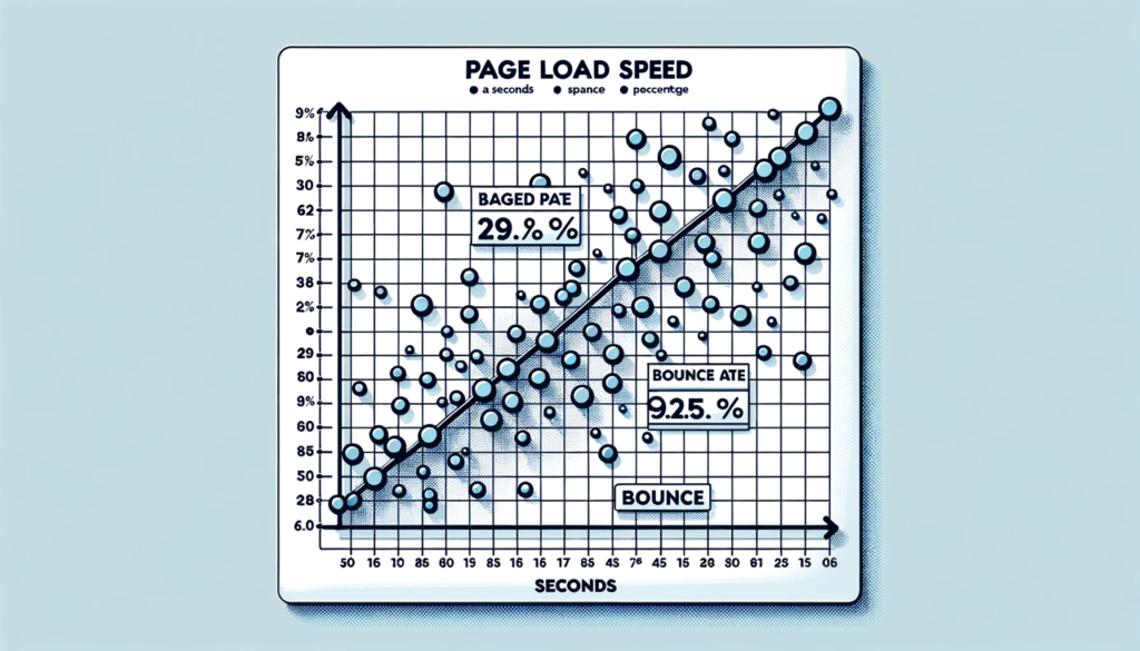
Image Optimization
Compress and optimize images to reduce their file size without compromising quality. Use appropriate image formats, such as JPEG or WebP, and implement lazy loading techniques to load images only when they are visible on the screen.
Minify Code
Minify your website’s HTML, CSS, and JavaScript files by removing unnecessary characters, spaces, and line breaks. This reduces file sizes and improves loading speed.
Enable Browser Caching
Leverage browser caching by setting expiration dates for static resources on your website. This allows returning visitors to load your site faster as their browsers can retrieve certain files from their cache instead of downloading them again.
Mobile-Friendly Testing
Regularly testing your website’s mobile-friendliness is crucial to ensure optimal performance. Google’s Mobile-Friendly Test and other online tools can help you identify any issues or areas for improvement. By addressing these issues promptly, you can enhance your website’s mobile user experience and improve its visibility in mobile search results.
By implementing a mobile-friendly website design, you can provide a seamless browsing experience for mobile users, improve your mobile SEO rankings, and ultimately drive more traffic and conversions to your website.
Responsive Web Design
Responsive web design is a crucial aspect of mobile SEO as it ensures that your website is optimized for mobile users. With the increasing use of smartphones and tablets, it is essential to provide a seamless browsing experience across different devices and screen sizes.

Definition and Importance
Responsive web design refers to the approach of designing and developing a website that automatically adjusts its layout and content based on the user’s device. It uses CSS media queries to detect the screen size and adapt the design accordingly. This eliminates the need for separate mobile and desktop versions of the website, providing a consistent user experience.
The importance of responsive web design lies in the fact that it improves user engagement and satisfaction. Mobile users expect websites to load quickly and display properly on their devices. If a website is not mobile-friendly, users are more likely to abandon it and look for alternatives. Additionally, search engines like Google prioritize mobile-friendly websites in their search results, making responsive design crucial for SEO.
Key Elements of Responsive Web Design
Fluid Grids
A fluid grid system is the foundation of responsive web design. It allows the website layout to adapt and resize proportionally to different screen sizes. By using relative units like percentages instead of fixed pixels, elements on the page can adjust dynamically.
Flexible Images and Media
Images and media elements should also be responsive to ensure they scale and fit within the available screen space. This can be achieved by setting the maximum width of images to 100% and using CSS media queries to adjust their size and resolution based on the device.
Media Queries
Media queries are CSS rules that apply different styles based on the characteristics of the user’s device, such as screen size, resolution, and orientation. By using media queries, you can create breakpoints where the layout and design of the website change to accommodate different devices.
Mobile-Friendly Navigation
Navigation is a critical aspect of user experience on mobile devices. It is important to design a navigation menu that is easy to use on smaller screens. This can be achieved by using collapsible menus, hamburger icons, or sticky navigation bars that remain visible as the user scrolls.
Benefits of Responsive Web Design
Improved User Experience
Responsive web design ensures that your website looks and functions well on any device, providing a seamless and consistent user experience. Users can easily navigate, read content, and interact with your website, leading to increased engagement and lower bounce rates.
Better SEO Performance
Search engines prioritize mobile-friendly websites in their search results. By implementing responsive web design, you improve your website’s chances of ranking higher in mobile search results. This can lead to increased organic traffic and visibility for your website.

Cost and Time Efficiency
Maintaining separate mobile and desktop versions of a website can be time-consuming and costly. Responsive web design eliminates the need for multiple versions, allowing you to manage and update your website more efficiently. It also saves development time as changes made to the responsive design automatically apply to all devices.
Future-Proofing
With the continuous evolution of devices and screen sizes, responsive web design ensures that your website remains compatible and accessible to users in the future. By adapting to new technologies and devices, you can future-proof your website and stay ahead of the competition.
In conclusion, responsive web design is a fundamental aspect of mobile SEO. By creating a website that adapts to different devices and screen sizes, you can provide an optimal user experience, improve SEO performance, and future-proof your website.
Mobile Page Speed Optimization
Importance of Mobile Page Speed
Mobile page speed refers to the time it takes for a webpage to load on a mobile device. It is a crucial factor in providing a positive user experience and plays a significant role in mobile SEO.

Impact on User Experience
Reduced Bounce Rates: Slow-loading pages often lead to higher bounce rates as users tend to abandon websites that take too long to load. Optimizing mobile page speed helps retain users and encourages them to explore further.
Improved Engagement: Faster loading times enhance user engagement by allowing visitors to quickly access the desired content, resulting in increased page views, longer session durations, and higher conversion rates.
Techniques for Mobile Page Speed Optimization
Optimize Images: Compress and resize images to reduce their file size without compromising quality. Use modern image formats like WebP and lazy loading techniques to load images only when they are visible on the screen.
Minify Code: Minify HTML, CSS, and JavaScript files by removing unnecessary characters, spaces, and line breaks. This reduces file sizes and improves loading speed.
Enable Browser Caching: Leverage browser caching by setting appropriate cache headers to allow returning visitors to load your website faster. This reduces the number of HTTP requests and improves overall performance.
Reduce Redirects: Minimize the use of redirects as they add additional HTTP requests and increase loading time. Instead, use direct links to the final destination whenever possible.
Optimize CSS and JavaScript: Combine and minify CSS and JavaScript files to reduce the number of requests made by the browser. This helps in faster rendering of the webpage.
Prioritize Above-the-Fold Content: Load critical above-the-fold content first to ensure that users can see and interact with the most important parts of the page without waiting for the entire page to load.
Use Accelerated Mobile Pages (AMP): Implement AMP, a framework developed by Google, to create lightweight and fast-loading versions of web pages specifically designed for mobile devices.
Optimize Server Response Time: Improve server response time by using a reliable hosting provider, optimizing database queries, and implementing caching mechanisms.
Utilize Content Delivery Networks (CDNs): Distribute website content across multiple servers worldwide to reduce latency and deliver content faster to users in different geographical locations.
Test and Monitor Performance: Regularly test your website’s mobile page speed using tools like Google PageSpeed Insights or GTmetrix. Monitor performance metrics and make necessary optimizations to ensure consistent speed.
By implementing these mobile page speed optimization techniques, you can enhance user experience, reduce bounce rates, and improve your website’s visibility in mobile search results.
Voice Search Optimization
Voice search is becoming increasingly popular as more and more users rely on voice assistants like Siri, Google Assistant, and Alexa to perform searches on their mobile devices. Optimizing your website for voice search can help you reach a wider audience and improve your overall mobile SEO strategy.
Understanding Voice Search
Voice search is a technology that allows users to perform searches by speaking their queries instead of typing them. It utilizes natural language processing and artificial intelligence to understand and interpret user commands. Voice assistants then provide spoken responses or display relevant information on the device screen.
Importance of Voice Search Optimization
With the rise of voice assistants and smart speakers, optimizing your website for voice search has become crucial. Here’s why:
Changing Search Behavior: Voice search has altered the way people search for information. Users tend to ask longer, conversational queries when using voice assistants, compared to the shorter, keyword-focused queries used in traditional text-based searches.
Mobile Dominance: Voice search is predominantly used on mobile devices. As mobile usage continues to grow, optimizing your website for voice search ensures that you are catering to the needs of mobile users.
Featured Snippets: Voice assistants often provide answers to user queries by pulling information from featured snippets. By optimizing your content to appear in these snippets, you increase the chances of your website being selected as the voice assistant’s response.
Optimizing for Voice Search
To effectively optimize your website for voice search, consider the following strategies:
Long-Tail Keywords: Focus on using long-tail keywords that mimic natural language and conversational queries. These keywords are more likely to match the way users speak when using voice search.
Question Phrases: Incorporate question phrases into your content to align with the queries users ask voice assistants. Answering common questions related to your industry or niche can help improve your chances of appearing in voice search results.
Structured Data Markup: Implement structured data markup on your website to provide search engines with additional context about your content. This can help voice assistants better understand and extract relevant information from your web pages.
Page Speed Optimization: Ensure that your website loads quickly on mobile devices. Voice search users expect fast and seamless experiences, so optimizing your website’s performance is crucial for voice search optimization.
Local SEO: Optimize your website for local search queries, as voice search is often used for finding nearby businesses or services. Include location-specific keywords and ensure your business information is accurate and up to date.
Mobile-Friendly Design: Create a responsive and mobile-friendly website design that provides a seamless user experience across different devices. This includes using large, easy-to-read fonts, optimizing for touch interactions, and ensuring your website is accessible and user-friendly.
By implementing these voice search optimization strategies, you can enhance your website’s visibility and accessibility to voice assistant users, ultimately improving your mobile SEO efforts.
Local SEO for Mobile Users
Local SEO plays a crucial role in optimizing your website for mobile users. With the increasing use of smartphones and the growing importance of local searches, it is essential to ensure that your website is optimized for local SEO to attract mobile users in your target area. Here are some key aspects to consider:
Location-based keywords
When optimizing your website for local SEO, it is important to incorporate location-based keywords throughout your content. This helps search engines understand the geographical relevance of your website and improves its visibility in local search results. Include relevant keywords that are specific to your target location in your page titles, headings, meta descriptions, and content.
Google My Business
Creating and optimizing your Google My Business (GMB) listing is crucial for local SEO. Ensure that your GMB profile is complete and accurate, including your business name, address, phone number, and website URL. Add relevant categories, business hours, and high-quality images. Encourage customers to leave reviews on your GMB listing, as positive reviews can boost your local search rankings.
Mobile-friendly website design
Mobile users expect a seamless browsing experience, so it is essential to have a mobile-friendly website design. Optimize your website for mobile devices by using responsive design, which automatically adjusts the layout and content based on the user’s screen size. Ensure that your website loads quickly, as mobile users have less patience for slow-loading pages.
Local content optimization
Create localized content that caters to the needs and interests of your target audience. Incorporate location-specific keywords naturally within your content, including blog posts, articles, and landing pages. Provide valuable information about local events, attractions, and resources that are relevant to your target location. This helps establish your website as a trusted source of information for local users.
Online directories and citations
Listing your business in online directories and local citations can significantly improve your local SEO. Ensure that your business information is consistent across all directories, including your name, address, phone number, and website URL. Popular directories to consider include Yelp, Yellow Pages, and TripAdvisor. These listings not only improve your visibility but also provide valuable backlinks to your website.
Mobile-friendly maps and directions
Make it easy for mobile users to find your business by integrating mobile-friendly maps and directions on your website. Embed a Google Map with your business location and provide clear instructions on how to reach your establishment. This enhances the user experience and encourages mobile users to visit your physical location.
Local schema markup
Implementing local schema markup on your website can help search engines understand your business’s location and other relevant information. Schema markup provides additional context to search engines, improving the visibility of your website in local search results. Include schema markup for your business name, address, phone number, opening hours, and customer reviews.
By implementing these local SEO strategies, you can optimize your website for mobile users and improve your visibility in local search results. This, in turn, can drive more targeted traffic to your website and increase your chances of attracting local customers.
Mobile Analytics and Tracking
Mobile analytics and tracking play a crucial role in understanding and optimizing the performance of your website for mobile users. By analyzing data and tracking user behavior, you can gain valuable insights into how your mobile site is performing and make informed decisions to improve its effectiveness.
Importance of Mobile Analytics
Mobile analytics provide you with detailed information about how users interact with your website on mobile devices. This data helps you understand user behavior, preferences, and patterns, enabling you to tailor your mobile site to meet their needs and expectations. By tracking mobile analytics, you can identify areas of improvement, optimize user experience, and drive better results.
Key Metrics to Track
Mobile Traffic: Monitor the amount of traffic coming from mobile devices to gauge the importance of mobile optimization for your website. This metric helps you understand the proportion of users accessing your site through mobile devices.
Bounce Rate: Bounce rate measures the percentage of visitors who leave your site after viewing only one page. Tracking the bounce rate on mobile devices helps you identify any issues that may be causing users to leave your site quickly, such as slow loading times or poor mobile design.
Conversion Rate: Conversion rate tracks the percentage of visitors who complete a desired action, such as making a purchase or filling out a form. Analyzing the conversion rate on mobile devices allows you to identify any barriers or friction points in the mobile user journey and optimize for better conversions.
Page Load Speed: Mobile users expect fast-loading websites. Monitoring the page load speed on mobile devices helps you identify any performance issues that may be affecting user experience. Slow loading times can lead to higher bounce rates and lower conversions.
User Engagement: Analyze metrics such as time spent on site, number of pages visited, and scroll depth to understand how engaged mobile users are with your content. This data can help you identify areas where you can improve engagement and optimize the mobile user experience.
Tools for Mobile Analytics
Several tools are available to track and analyze mobile analytics effectively. Some popular options include:
Google Analytics: Google Analytics provides comprehensive mobile analytics, allowing you to track mobile traffic, user behavior, conversions, and more. It offers valuable insights into how users interact with your mobile site and helps you make data-driven decisions.
Heatmap Tools: Heatmap tools like Hotjar or Crazy Egg provide visual representations of user behavior on your mobile site. These tools show where users click, scroll, and spend the most time, helping you identify areas of interest and potential improvements.
App Analytics: If you have a mobile app, utilizing app analytics tools like Firebase or Flurry can provide valuable insights into user behavior within your app. These tools track app usage, engagement, and conversions, allowing you to optimize the mobile app experience.
Conclusion
In conclusion, mastering Mobile SEO is a pivotal stride in staying ahead in the digital realm. It goes beyond merely attracting traffic; it’s about delivering a seamless user experience, achieving higher search engine rankings, and aligning with mobile-first indexing. The surge in mobile users highlights the exigency of adapting to mobile SEO best practices.
Furthermore, optimizing your website for mobile is a vital cog in constructing a robust online sales funnel, which is a linchpin for converting visitors into loyal customers. If you’re on the lookout for software solutions to bolster this process, don’t miss our in-depth review on the Best Sales Funnel Software: Top 5 Tools for Maximizing Conversions. This exploration will equip you with the tools necessary to optimize your sales funnels effectively, ensuring a holistic approach to mobile optimization and online marketing.